ArcGIS Explorer Online Critique
Design Critique
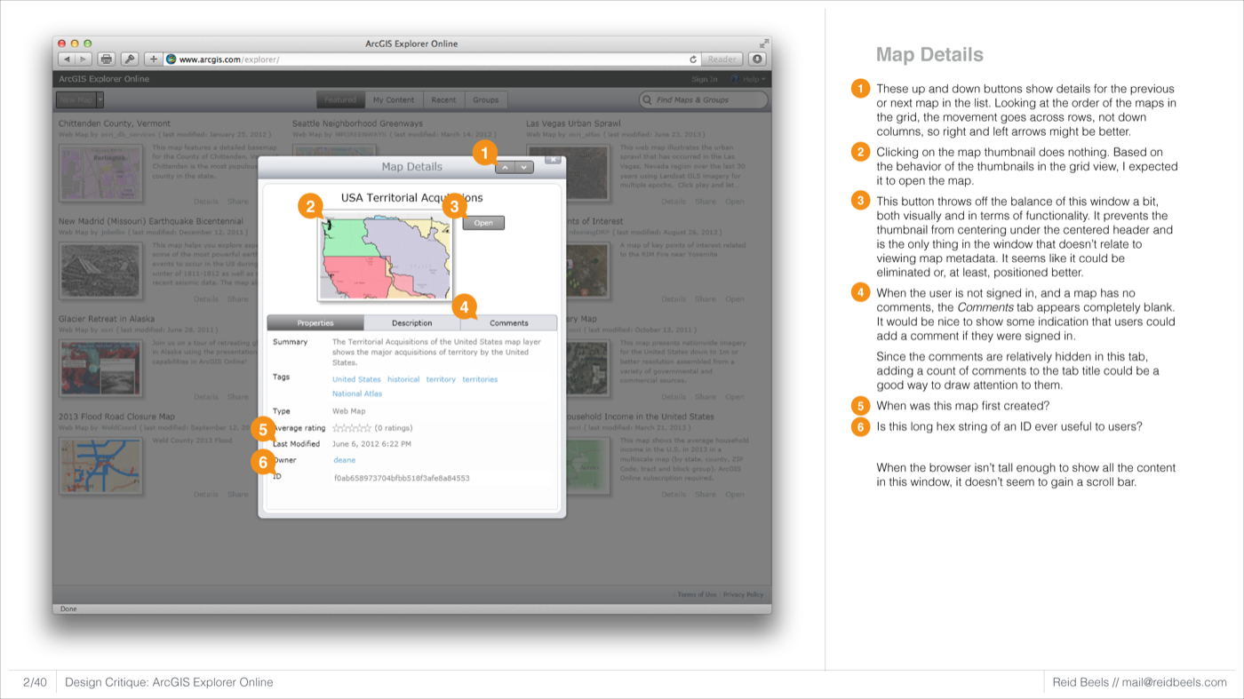
I was once asked as part of an interview to critique the design and usability of a complex web application. I chose to examine Esri's ArcGIS Explorer Online and produced a document highlighting interface inconsistencies and offering suggestions for improvement.
